USPS Delivers
Government logistics site that actually looks like it was designed.
Why it works
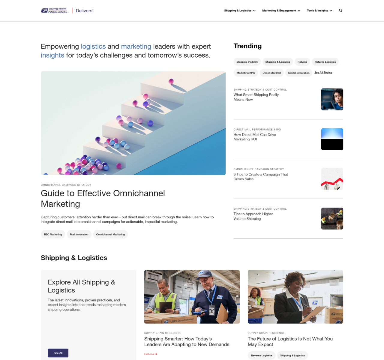
USPS Delivers avoids the cluttered, dated aesthetic typical of government and logistics sites by using a structured card-based layout, clear typographic hierarchy, and a professional blue palette that communicates reliability without feeling cold. The mega-menu with category previews organises a large content estate without overwhelming visitors. A masterclass in making utilitarian information feel accessible.
Who should look at this
Businesses in logistics, finance, or government services who need to present complex, multi-section content clearly and build trust with a professional audience.
Signature technique
A mega-menu with content previews lets visitors see what's inside each section before clicking — a pattern that reduces bounce on large informational sites by setting expectations upfront.
Like this style?
Take the style quiz to build your own shortlist, then generate a professional design brief you can hand directly to a developer — for $27.