Counter Forms
A type foundry that makes buying fonts feel like entering a gallery.
Why it works
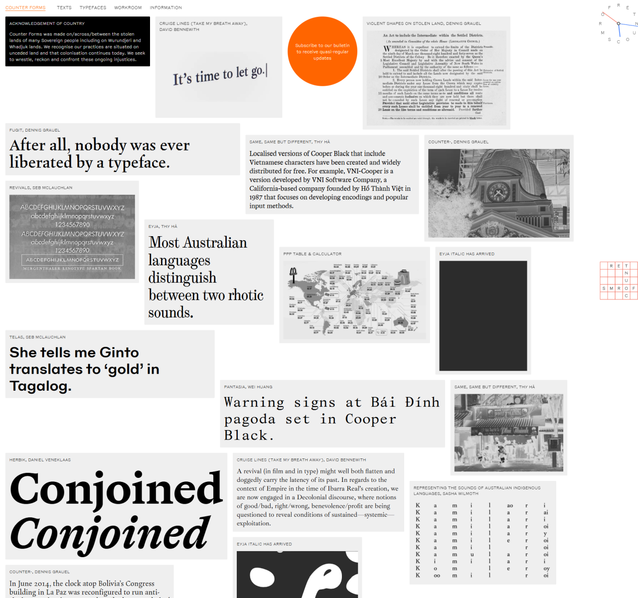
Counter Forms uses a predominantly dark interface with red accent colours appearing only on hover — a deliberate restraint that makes every interactive element feel significant. The masonry grid of typeface specimens creates a museum-like browsing experience where each face gets room to demonstrate its character. Drag-enabled card interactions and desaturation-to-saturation hover transitions add tactile delight without undermining the serious tone.
Who should look at this
Designers, brand builders, and type enthusiasts who want to purchase custom typefaces from emerging Antipodean designers and want the experience to feel as considered as the typefaces themselves.
Signature technique
Typeface specimen cards are presented desaturated and saturate to full colour only when hovered — focusing attention on one typeface at a time in a gallery full of competing personalities.
Like this style?
Take the style quiz to build your own shortlist, then generate a professional design brief you can hand directly to a developer — for $27.