Ramp
Finance software that feels like a product, not a spreadsheet
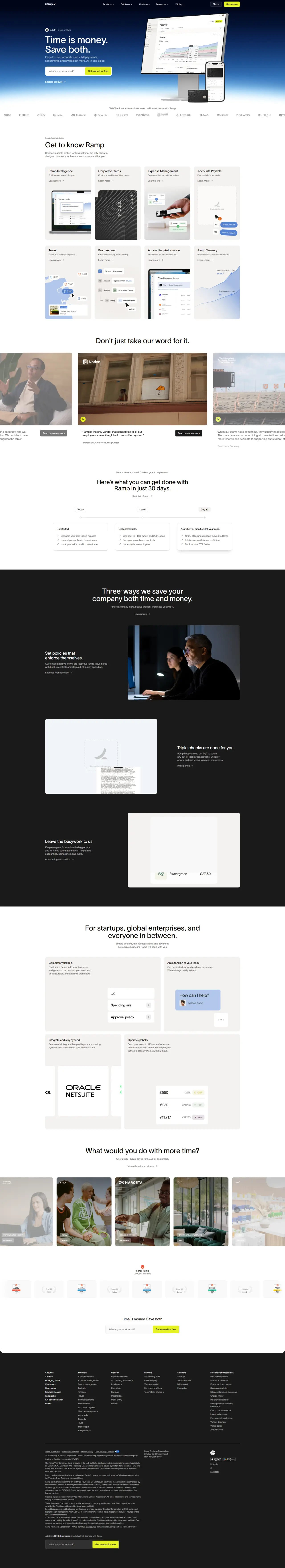
Why it works
Generous breathing room and a dark navy background create premium positioning without feeling cold or distant. Large confident typography paired with focused call-to-action buttons guides visitors naturally through the value proposition. The hero lands trust through tangible metrics — specific numbers and team counts — rather than vague promises.
Who should look at this
B2B SaaS founders who need to make enterprise software feel accessible and human rather than intimidating.
Signature technique
A restrained palette of navy, white, and one accent colour with substantial negative space — makes dense feature information feel lightweight and digestible rather than overwhelming.
Like this style?
Take the style quiz to build your own shortlist, then generate a professional design brief you can hand directly to a developer — for $27.