Magnetism
Parisian luxury agency using restraint as its sharpest weapon
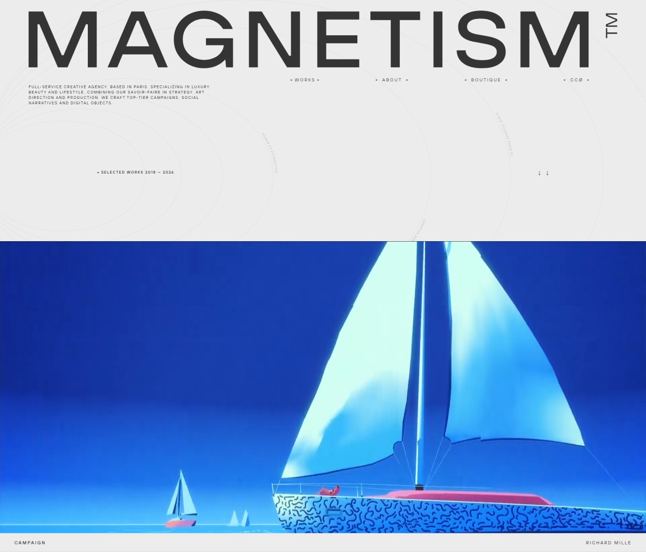
Why it works
The site trusts negative space and deliberate type pairing — large uppercase headers float against generous whitespace while a sophisticated grid contains project imagery. A muted cream background with dark text creates high contrast without shouting, letting the work breathe rather than compete for attention.
Who should look at this
B2B service founders building premium positioning through editorial restraint rather than visual noise.
Signature technique
A sticky header that fades on scroll while projects reveal on hover — invisible navigation hierarchy that feels effortless and keeps attention on the work at all times.
Like this style?
Take the style quiz to build your own shortlist, then generate a professional design brief you can hand directly to a developer — for $27.