Snøhetta
Architecture firm website as precise and considered as the buildings themselves.
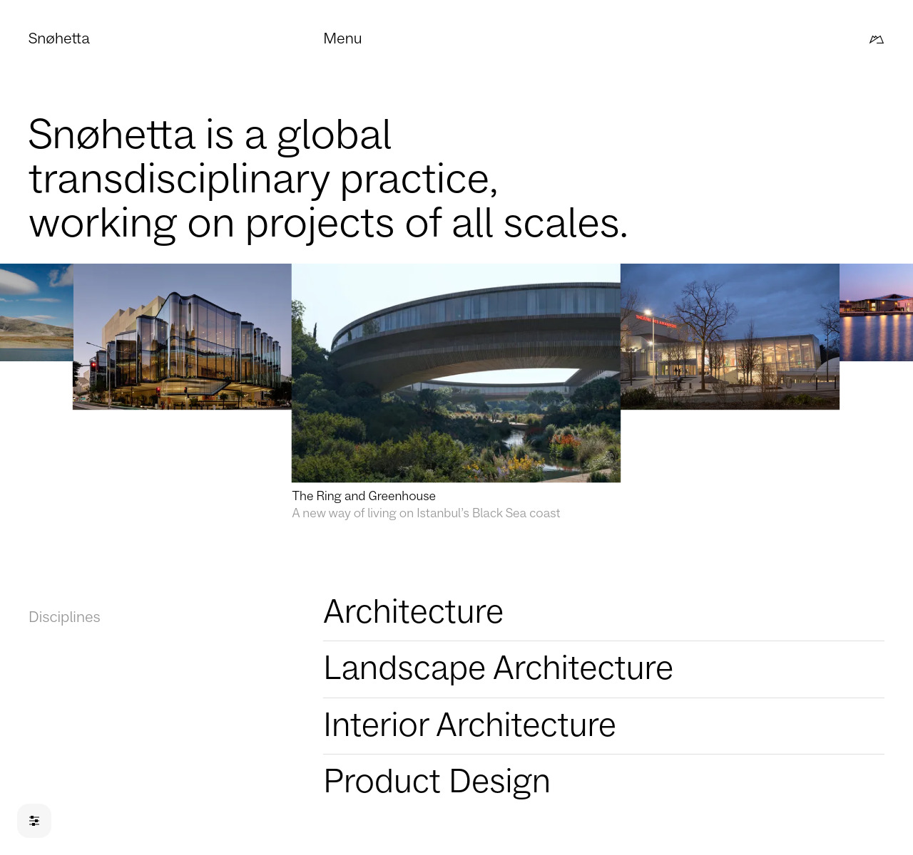
Why it works
Snøhetta applies architectural thinking to the screen: a grid-based project showcase, generous breathing room, and deliberate typographic hierarchy that lets large-scale photography carry the visual weight. The site respects the user's agency with a minimal data mode and dark mode toggle — both reflecting the practice's philosophy of purpose over decoration. Nothing is extraneous; every element has a job.
Who should look at this
Architecture, engineering, and professional services firms who want a portfolio that communicates rigour and confidence without relying on flashy interactions.
Signature technique
A 'minimal data mode' reduces image quality and simplifies layout on demand — a rare UI choice that communicates the firm's values (user agency, sustainability) more eloquently than any copyline could.
Like this style?
Take the style quiz to build your own shortlist, then generate a professional design brief you can hand directly to a developer — for $27.