Searchable
Calm, warm interface for a complex and noisy AI landscape
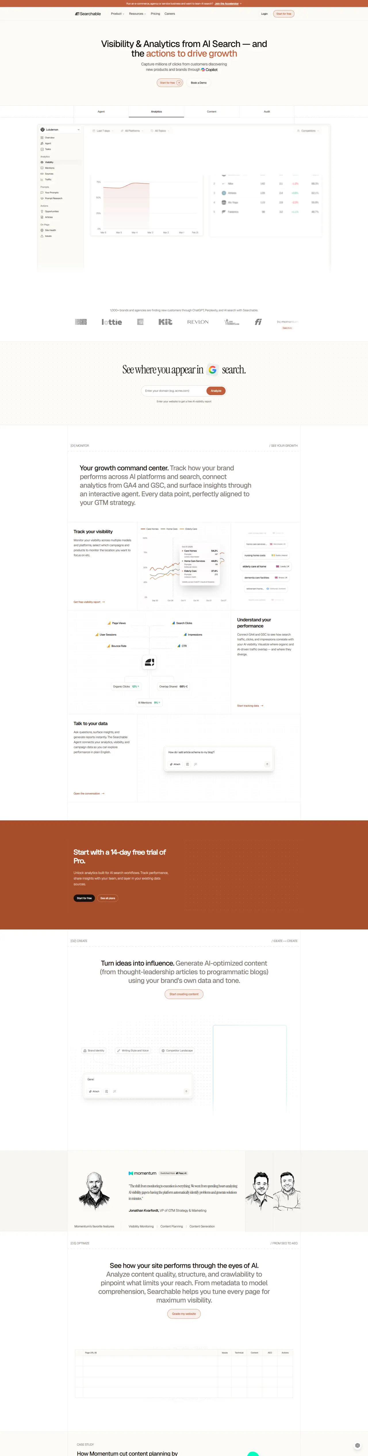
Why it works
A neutral sand-based colour system reduces cognitive load when processing complex data. Typography hierarchy guides visitors from benefit statements down to actionable features without visual clutter. A dark footer anchors the page while maintaining the peaceful aesthetic throughout.
Who should look at this
SaaS founders building information-dense dashboards who want to make complex software feel approachable rather than overwhelming.
Signature technique
Alternating full-width content blocks with constrained reading widths creates rhythm and prevents overwhelming visitors with too much horizontal scanning at once.
Like this style?
Take the style quiz to build your own shortlist, then generate a professional design brief you can hand directly to a developer — for $27.