Neon Rated
Cinematic restraint meets high-impact typography for film discovery
Why it works
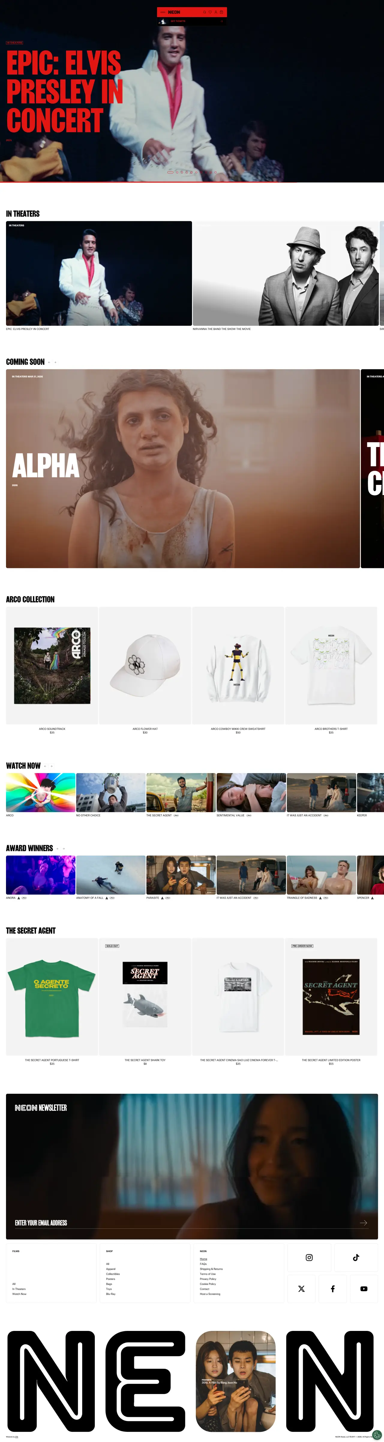
Massive film stills serve as hero images with near-invisible navigation, letting visuals dominate entirely. Typography is large and confident against dark backgrounds, creating immediate hierarchy. Strategic breathing room between film tiles prevents visual chaos while maintaining an exclusive, gallery-like atmosphere.
Who should look at this
Entertainment brands and media companies wanting to prioritise content discovery over navigation clutter.
Signature technique
Full-bleed hero image with centred minimal text overlay, followed by a grid layout with a consistent image-to-title ratio — a card pattern worth stealing for any portfolio or catalogue.
Like this style?
Take the style quiz to build your own shortlist, then generate a professional design brief you can hand directly to a developer — for $27.