Middle Name
Branding studio with a warm, confident identity that practises what it preaches.
Why it works
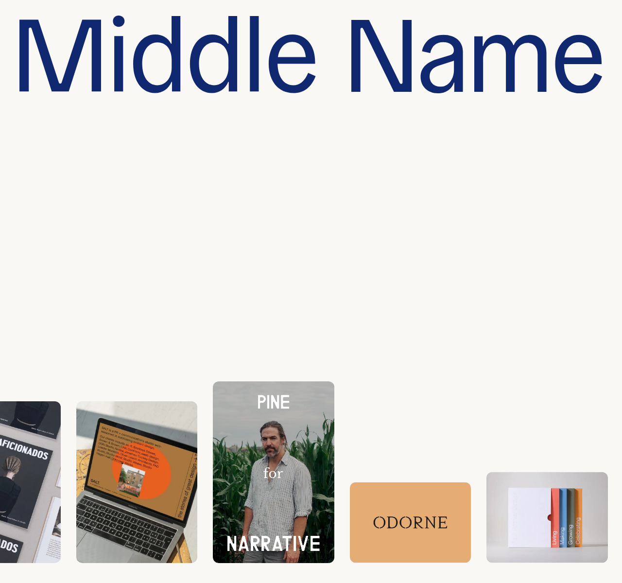
Middle Name's palette — navy blue, terracotta, dusty rose, and cream — reads warm and considered rather than corporate or cool. A full-viewport marquee of portfolio imagery runs continuously above fixed pill-shaped navigation buttons, creating momentum without a single gratuitous animation. The custom 'General Grotesque' typeface in semi-bold anchors the layout with quiet authority.
Who should look at this
Founders and brand owners who want to commission a branding studio and need to see that the designer has genuine taste and strategic thinking, not just nice visuals.
Signature technique
Pill-shaped navigation buttons are colour-coded by section and pinned to the bottom of the viewport — keeping the full-width portfolio imagery front and centre while the nav stays accessible.
Like this style?
Take the style quiz to build your own shortlist, then generate a professional design brief you can hand directly to a developer — for $27.