Linear
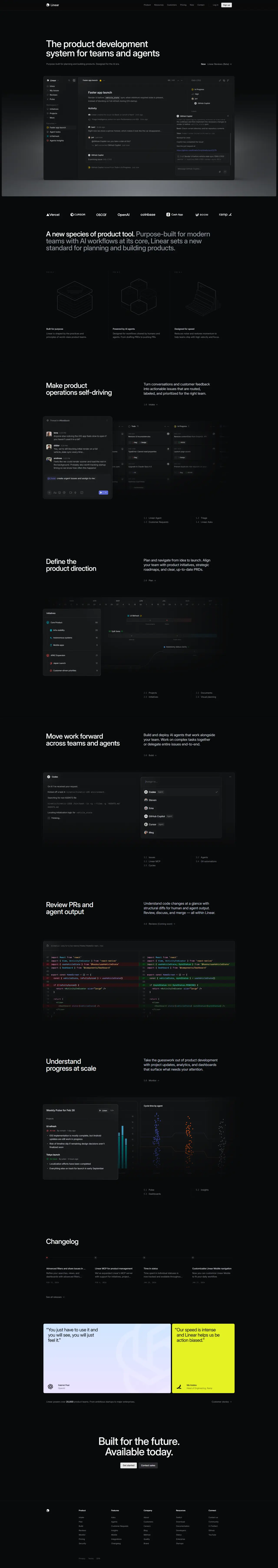
Dark precision that makes complex software feel inevitable
Why it works
The interface uses a carefully weighted type system with defined hierarchies and generous breathing room that prevents cognitive overload. Dark tones with subtle
colour accents — reds and greens for status — create visual distinction without noise. The grid-based animation in the hero demonstrates motion as functional information, not
decoration.
Who should look at this
SaaS founders building for power users who value clarity and speed over flashiness.
Signature technique
Calculated keyframe animations on scroll where each element enters sequentially with a small delay — guides the eye downward like a visual outline rather than dumping everything at once.
Like this style?
Take the style quiz to build your own shortlist, then generate a professional design brief you can hand directly to a developer — for $27.