Everlane
Radical simplicity that lets product quality speak for itself
Why it works
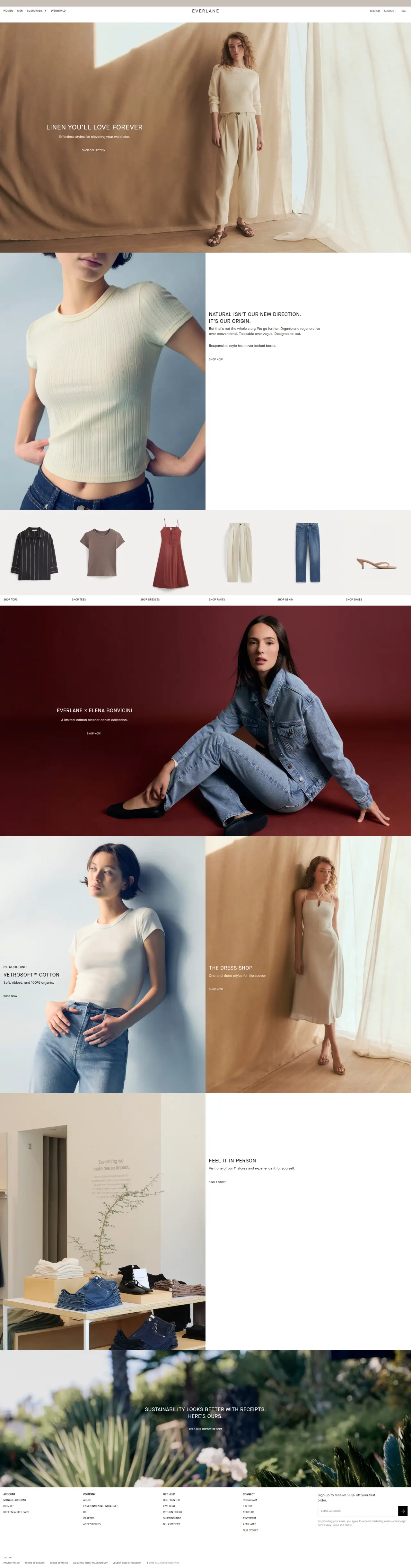
The design strips away visual noise with generous breathing room and a restrained colour palette of whites, blacks, and warm grays. Typography feels editorial — confident headlines paired with compact body copy. Product imagery breathes naturally without forced styling, letting quality do the persuading.
Who should look at this
Founders selling considered goods who want premium positioning without ostentatious design flourishes.
Signature technique
Use negative space as your primary design element — let empty areas guide attention to content, then anchor each section with one bold typographic statement.
Like this style?
Take the style quiz to build your own shortlist, then generate a professional design brief you can hand directly to a developer — for $27.