Developments
Slow journalism, fast design — interviews that respect your attention.
Why it works
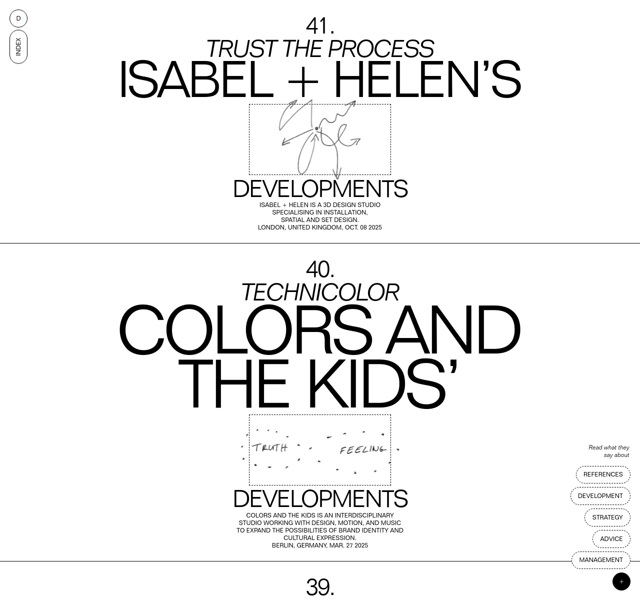
Developments uses numbered interviews in a clean grid of portrait photographs, letting the faces and thematic titles ('Trust the Process', 'Technicolor', 'Sound & Vision') carry the visual weight. The monochromatic, sans-serif layout creates no competition with the subjects themselves — minimal structure signals editorial integrity over visual noise. Five years of 40+ consistently presented interviews builds credibility through discipline alone.
Who should look at this
Founders building a content-led brand or editorial platform who want to see how restraint and consistency communicate authority better than visual complexity.
Signature technique
Every interview is treated identically — a numbered portrait card with a thematic title and no excerpt — the uniformity creates a sense of archive and authority that feels editorial rather than bloggy.
Like this style?
Take the style quiz to build your own shortlist, then generate a professional design brief you can hand directly to a developer — for $27.