Clairoux studio
Graphic design portfolio as restrained as the brand systems it creates.
Why it works
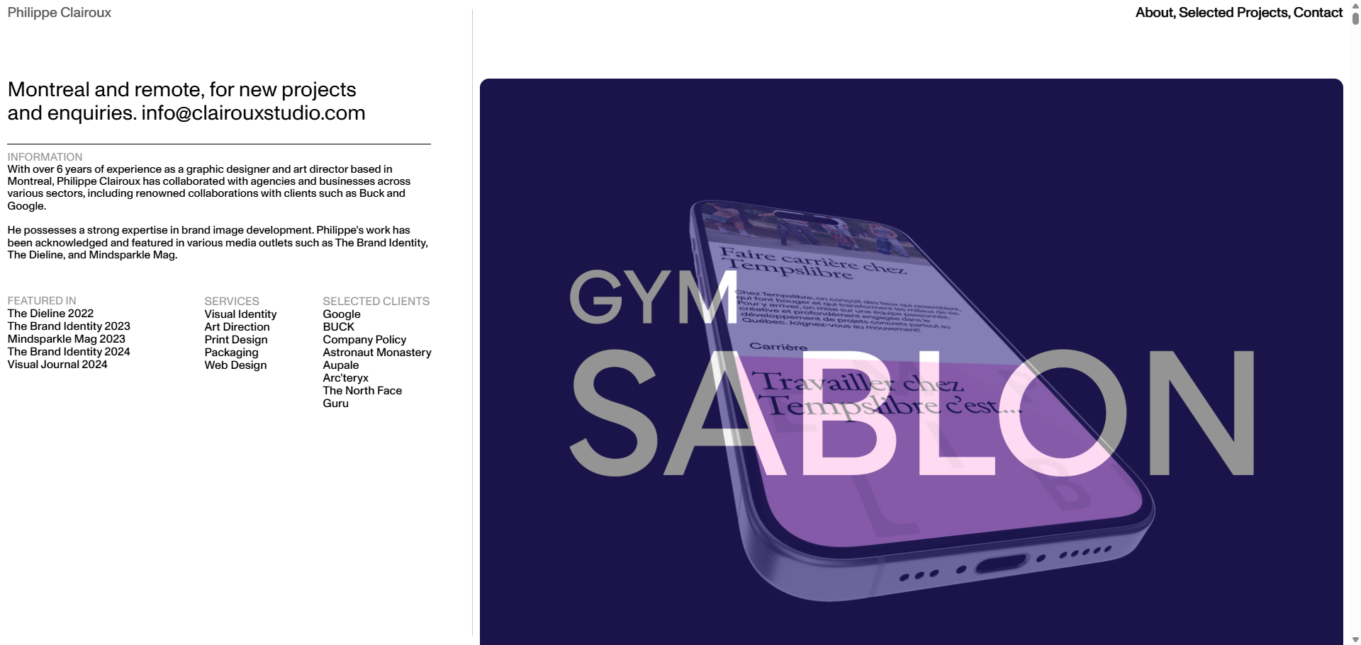
Clairoux Studio uses Monument Grotesk Variable and Neue Haas Grotesk — two precision-crafted contemporary typefaces — against a minimal black-on-white layout to present packaging, branding, and visual identity work with maximum clarity. Content takes up no more than 65% of the page width, creating disciplined breathing room. Hover states using CSS 'difference' blend mode add an interactive dimension that feels considered rather than decorative.
Who should look at this
Brand owners and creative directors who want to commission a graphic designer and need to see that the designer's own visual standards match the quality they promise for clients.
Signature technique
Hover states use CSS mix-blend-mode 'difference' — a technique that inverts colours contextually based on what's beneath the cursor, creating a visually striking effect without any JavaScript.
Like this style?
Take the style quiz to build your own shortlist, then generate a professional design brief you can hand directly to a developer — for $27.